The work.

A selection of our work — all live, all running for real businesses in Trinidad. Open any of them in another tab and judge for yourself. That is the only portfolio claim worth making. Ask us if you’d like to see more, or something closer to your line of work.

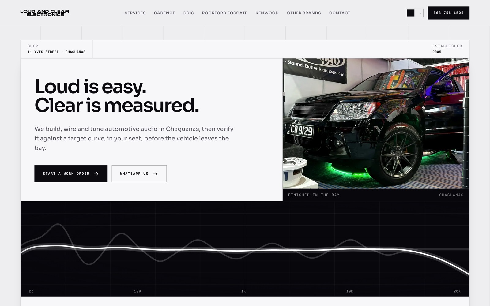
The Loud & Clear Electronics homepage: the headline “Loud is easy. Clear is measured.” beside a photo of an installed vehicle, above a full-width frequency response graph.

Loud & Clear Electronics

loudandcleartt.net ↗

Car audio installation · Chaguanas

The problem

Everybody in car audio sells loudness. This shop’s actual difference is that it measures. Every install is verified against a target curve, in the customer’s seat, before the vehicle leaves the bay. No photograph of a subwoofer can make that argument.

What we built

  • Built the site as the shop’s own installation document: a job card. Achromatic on purpose, so the equipment photography carries every bit of colour on the page.
  • The homepage opens on a live frequency-response curve rendered in WebGL, because the measurement is the pitch.
  • The ten services and their budget bands are lifted verbatim from the shop’s own booking form, so a customer arriving from Instagram sees the same language they will hear in the bay.
Multi-page WebGL Brand pages WhatsApp booking
Next.js Tailwind CSS Three.js GSAP
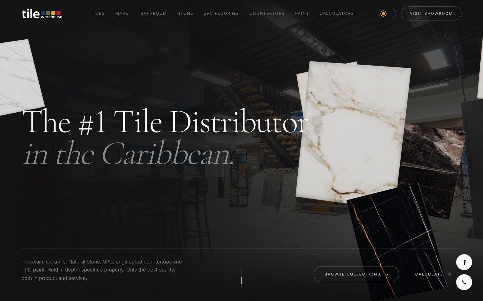
The Tile Warehouse homepage: the headline “The #1 Tile Distributor in the Caribbean” over a dim showroom photo, with marble slabs floating across the frame.

Tile Warehouse

tilewarehousett.com ↗

Tile, stone, countertops & paint

The problem

A distributor holding eight product categories in real depth — porcelain, ceramic, natural stone, SPC flooring, engineered countertops, bathroom, MAPEI and PPG paint — against a customer who turns up with exactly one question: how much do I need, and do you have it.

What we built

  • Eight product sections that stay genuinely browsable on a phone, because that is where the shopping happens before anyone drives to a showroom.
  • Material calculators that do the arithmetic on the spot, so the answer to “how many boxes” arrives before the phone call does.
  • Light and dark modes, both fully designed. Tile is judged on colour, and people shop in both.
Product catalogue Calculators Light + dark Multi-page
Next.js Tailwind CSS Three.js
The Trading Society homepage: “CLOSE THE GAP” set in a large didone serif, beside a pink guilloche rosette and a membership price card.

The Trading Society

thetradingsociety.com ↗

Trading education membership

The problem

The category is saturated with get-rich-quick marketing. A membership that genuinely teaches had to look like the opposite of that within one screen, and had to say its price out loud while every competitor hides theirs behind a webinar.

What we built

  • The identity is an engraved share certificate. The guilloche rosette is generated as real hypotrochoid curve mathematics in SVG. The browser draws it; it is not an image file.
  • The price sits in the first viewport, stated plainly, next to the headline.
  • The client supplied beta testimonials claiming four-figure percentage returns. We published the quotes and removed every figure, because unverified performance claims are the exact signature the brand was trying to escape.
Generative SVG Light + dark Membership Editorial
Next.js Tailwind CSS Motion

Yours could be the fourth.

Tell us what you sell and who you sell it to. We’ll come back with a direction, not a template deck.